When you shoot in .jpg the file you get on your camera is already a partially finalized image. Who finalized? You did, when you chose exposure, white balance, contrast, sharpening and other things that are in the picture style menu. The camera itself, only shoots in RAW, that is of its nature and this cannot be changed. If you said that you wanted .jpg images, it will check the settings you picked or, more often, just let them as they were, by default, and the camera will render the RAW file straight to .jpg according to your will or omission.
Thinking this way, we see that the general opinion about RAW is contrary to logic. The amateurs and beginners should use RAW extensively, and only those who know photography a lot could do everything directly in .jpg. RAW is for those who are not sure about how they want the finished image and prefer to leave the maximum possibilities for post production. The .jpg is good for those who, looking at a scene, already have in mind exactly the final picture they want and can adjust the camera in order to render that image at first.
What is a RAW file
When shutter opens and light goes through the lens and makes a rain of photons on the digital sensor, what happens there is independent of all the adjustments you might have done in your camera. In that lapse of time everything that happens there is an affair between the light and the sensor alone, nothing more. Only afterwards we enter the territory of interpretations, manipulations, multiplications, interpolations… and that will make this mere count of photons, that have fallen into certain boxes of a thin mesh, constitute an image.
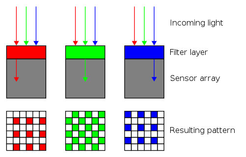
The sensor is a grid, a matrix, where each cell will correspond to a pixel. For CMOS sensors, which equip most cameras, it is not possible to make each pixel distinguish and report relative intensities of the three colors of the RGB standard. Each cell is specialized in one of three colors. We then have a situation as illustrated in the diagram above.
This is what the sensor actually records. It takes a minimum of light of a specific color for a cell to be able to read something. Below that minimum, it returns a zero count. There is a maximum of light from which the cell gets saturated and can no longer distinguish different quantities above that threshold. It becomes totally full. Between one extreme and another photography happens.
The RAW file is the rawest thing that you can take out of a camera. Raw in the straight sense of “not prepared”. Many operations must be performed after this reading of light intensities and that will form an image that looks like photography. The first of those is to fill in the empty cells for each color. This is done by a certain average of neighboring cells. It is called demosaicing. Then you have to adjust the sensitivity curve of the sensor to make it look more like our eyes and a series of further operations.
There is a lot of literature on the web about these processes. I particularly like the Cambridge in Colour. Another source with information that complets what I am presenting here you can find at : Digiarty – Videoproc. In this article I will limit myself to explore a little more, through an example, what for me is determinant of my choice for shooting in RAW most of the time. That is about the question of color depth offered by these files.
RAW and color depth
Each pixel for each RGB color is capable of storing a number of gradations ranging from the weakest to the strongest, from almost black to the brightest light, in that color, that the hardware, where it will be rendered, can produce. If this is not familiar to you then you need to first read: Pixel’s Anatomy and Color Depth. Since the human eye cannot distinguish neighboring variations when an RGB image has 8 bits per channel, 24 bits in total, and that corresponds to 16 Millions of colors, finalized color image files, such as .jpg, .png, or .tiff, are usually fine with these 24 bits. However, the RAW file usually has a much larger color depth, 12 or 14 bits are very common. This means 4096 or 16384 gradations of each color versus only 256 of the .jpg having 8 bits. But what for? We can’t see those differences! Some will say. But wait, let’s look at a case study.
When you look at a scene with very strong variations between areas of dense shadows, and other well-lit areas, your eyes will, as they go through these areas, adapting to each one of them and thus being able to see details in all of them. But this is something that happens in time, as they roam the scene and goes changing its sensitivity using, for instance, the iris, however, photography is instantaneous, it is one reading, one record that exposes the whole scene with only one speed and one aperture in diaphragm. This is where the color depth of RAW files becomes an irreplaceable tool. We may say that it concentrates information that are like accumulating many readings in a single shot.
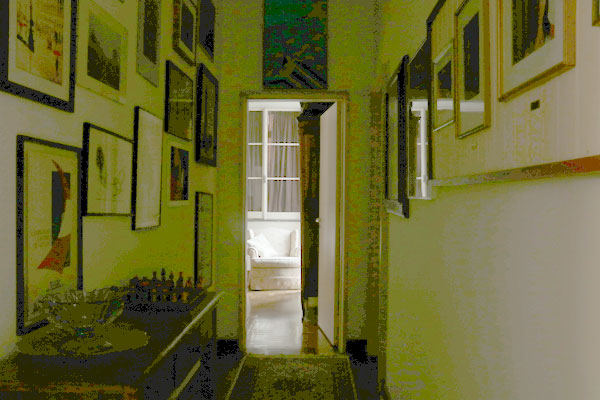
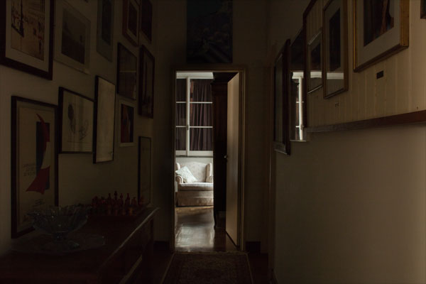
See this indoor photo in an apartment.
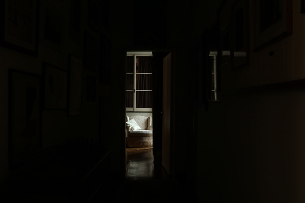
It was made directly on .jpg with a Canon T6i and manual exposure 1 s, f / 16 and a setting of 200 ASA. The whole area we see in black, when I photographed, I could perfectly see a corridor with furniture and things on the wall. It turned out black because I metered light aiming at the armchair at the back room.
But suppose that for some reason I want now to give viewers an idea of what was in the hall. The obvious way is to use Adjust Lighting > Shadows / Highlights. In the case I gave 100% Lighten Shadows and a bit of Darken Highlights to avoid the armchair to be washed out.
We can already see that it was exaggerated and the image degraded tremendously. Although we can see what was in that foreground, the general quality is very poor. Check the wall on the right as it does not feature a smooth and pleasant gradation of tones.
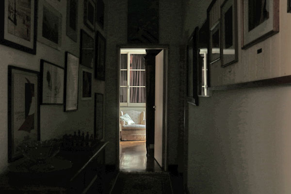
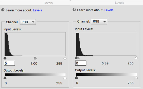
Another option is to try via Levels adjustment. Below is the before and after. Notice that the Middle Tones pointer was at 1 and it was taken far to the left, reaching 5.39. This affects that dark area of the original photograph, where all pixels have very low value and very compressed. They are forced to open up on a wider tonal range.
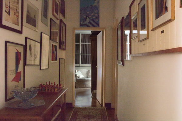
This is the result of that operation:
Now we can see that there was a little table with a glass made fruit bowl and further a chessboard … but what a miserable image. The reason for this deterioration is that all of these tones were compressed in a very tight region on the left side of the histogram, in its dark part. When we forced to introduce a difference where there were no intermediate tones to fill the gaps, that is what we got.
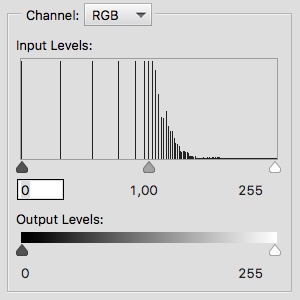
This is the histogram of the above image. That compact pile of near black pixels, which was on the far left in the previous histogram, was stretched far beyond its possibilities and that brought about flaws or striae. The 8-bit .jpg file may be true color but not flexible to zoom in any histogram area. This histogram ranges from 0 to 255, corresponds to the gradation of 256 tones per color of the RGB standard when in 8 bits. If it were a histogram of a file 12-bit per color, even stretching the area of shadows, there would be information to fill these gaps to some extent with actual colors that would have been captured by the sensor. Let’s then start it over again with a RAW file of a photo made under exactly the same conditions exposure conditions.
Now, the same but in RAW
When clicking to open the photo there comes the usual RAW dialog box where you can adjust several parameters that will guide the opening in an image editor like Photoshop. In the case of this photo specifically I increased the exposure and this causes the histogram to stretch to the right.
This caused the armchair part in the background to burst. In order to preserve richer information in each region, highlights and shadows, the same file was opened twice optimizing the reading in each of these zones. The larger color depth makes it look like RAW brings a built-in bracketing.
The photo below was obtained by throwing the dark image in a base layer and the image clear on top. Then, using a mask layer on the latter, a hole was opened by which we see through the armchair with the correct exposure. The quality of the gradation of tones in the part of the corridor is evidently better than in the image in .jpg in which we tried to do the same thing.
Below, the histogram of this image opened from a RAW file. It shows that there were far more information coming from the digital sensor. We did not see them in the first attempt because that was discarded when the camera itself produced its own .jpg. It did not streak, at least on this scale, we do not see gaps between neighboring tones.
This was an extreme case only to evidence the concept. Perhaps a better reading of this file would be something like the image below in which one does not try to render the shadows as if they were not shadows. The drawback of forcing too much the opening of areas like this is that even with bigger color depth there comes a threshold after which much noise starts to build up. For the example analyzed, this would cause a different texture to appear in the corridor area compared to the armchair area. But I believe that the example well illustrates the fact that RAW is better in the sense that it allows exploring possibilities that in the image taken directly in .jpg are no longer available. In this way, it ends up being the ideal format for those who need maximum flexibility and these, in general, are beginners and experimenters. So let us leave .jpg for professionals and shoot in RAW.
Comment with one click:
Was this article useful for you? [ratings]