Circle of confusion
When a lens is focused on an object right in front of it, the sharpest part of the image corresponds to the point where the lens axis meets the object. Everything around it, everything further away and everything closer will show a loss of sharpness in relation to this central point.
The axis of the camera lens
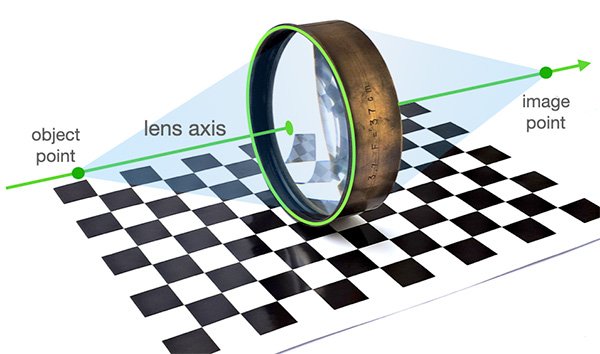
The axis is where the lens performs best. Everything that is off the lens axis, regardless of the position of the lens focus, will have some astigmatism and some of the aberration called coma. Lenses capable of correcting these aberrations appeared at the end of the 19th century. But the correction is never complete and that’s why we can say that “a little” sharpness is always lost off-axis due to these two aberrations, even in the most sophisticated lenses.
What’s more, the image formed by everything outside the axis of the lens is also subject to the focus adjustment, in the same way as what is on the axis, as we’ll see below.
On the axis
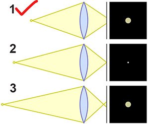
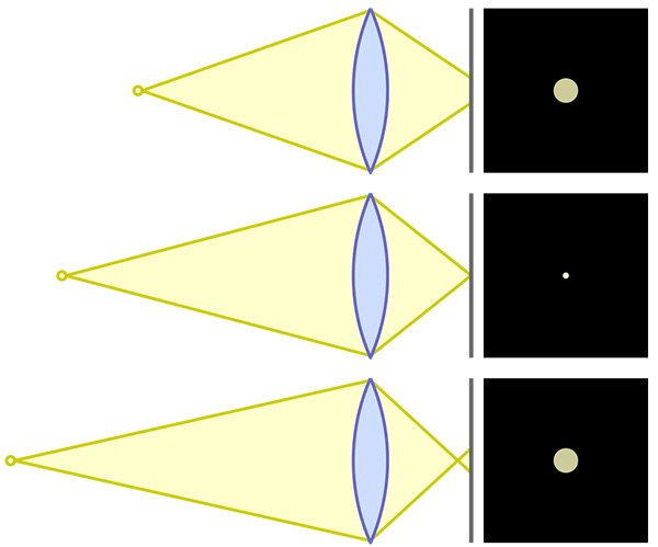
What is on the axis of the lens can be perfectly focused. In this condition, by performing a mathematical simulation, using the radii of curvature, distances, thicknesses and types of glass, an ideal geometric point on the object will theoretically correspond to an ideal geometric point on the image.
If you are a little ahead or a little behind the ideal focus point, this point will look like a disk. This is because the cone of light coming from the lens is cut off. This disk is what we call the Circle of Confusion, or CoC as it often appears in the literature. The diameter of this disk is the measure of the CoC.
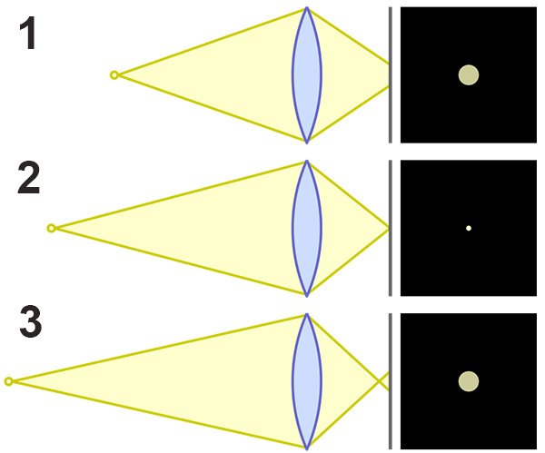
The name itself gives CoC the character of something undesirable: confusion. It would be nice if the whole image were perfectly sharp. But that can’t happen because lenses can’t focus on objects at different distances at the same time. Only one distance is focused. Beyond or before it, there is degradation. But this degradation, within certain limits, does not compromise the image.
An image is more than a point
One thing that can confuse those starting to study photographic optics is that books almost always represent only one point on the object and its corresponding point on the image, as in the diagram above.

Let’s then link this real image with the previous diagram to illustrate how the circle of confusion varies from one region to another.
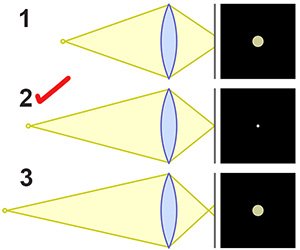
Thinking of the flower in the center of the image, its points are well focused, which means that the circles of confusion in that region were at their best, very small, meaning that the rays of light that the lens was converging on the sensor were crossing exactly over it, as in case 2 in the diagram. That’s why we can see all the details. Each point on the object flower corresponds to a point on the image flower.
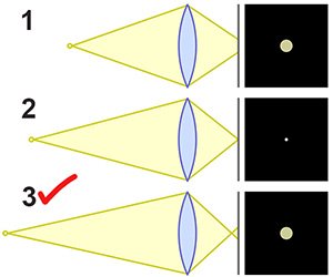
The flower further back is already in a situation like case 3 because it is further away, its rays diverge less to reach the lens and the lens has made them converge before the sensor. The Circles of Confusion become large and overlap, encroaching on each other, making the image blurry, lacking detail or simply: out of focus.
The first petal in the central flower is already slightly out of focus as in case 1. It is closer, its rays diverge strongly and the lens has directed them as if they were going to cross after the sensor. The result is again a loss of detail as the circles of confusion blend together and we have blur again.
The bee serves as a reminder that it’s not just the Circle of Confusion that can generate a blurred image. The movement of the subject or camera shake, when the shutter speed isn’t fast enough to freeze the movement, also results in another type of blur, but one that isn’t related to the lens alone.
CoC is not the ruin of the image
Any medium capable of recording an image has a finite resolution. It’s easy to see this in a digital sensor because it’s a regular grid. Roughly speaking, if we have 6000 x 4000 pixels in an area of 36 x 24 mm, we only need to divide to know that a pixel is approximately 6 x 6 thousandths of a millimeter. If the Circles of Confusion generated in a certain region of the image are smaller than 6 microns (thousandths of a millimeter), we won’t be able to see them as anything larger than a “dot”. We won’t see it as the disk we know it really is. In this sensor, it will have the same size as the perfectly focused point with a supposedly zero CoC. Both it and the super-focused point will occupy no more than 1 pixel.
A practical observation follows from this: the lens does not need to have more resolution than the medium that will record your image. Any detail in the image beyond the resolution of the film or sensor is, in a sense, a waste.
In the case of films, the situation is similar, except that instead of a grid of pixels we have to think of a cloud of silver crystals dispersed in gelatin. They also have an average size. If these grains are too large, there’s no point in the lens generating an image with a very small CoG because the film won’t be able to distinguish between neighboring points.
Geometric CoC
The CoC caused by the cone of light being cut by the film or sensor before or after it converges on a point, and which therefore generates a disk, is a condition of lens geometry in this specific matter of focus. To show that this is the case, it is given the complement Geometric Circle of Confusion. This is the CoC considered when thinking about Depth of Field, which is the extension, from the minimum distance to the maximum distance, within which the image of some object in this extension is considered sharp. From what we’ve seen, it means the region in which the CoC is smaller than the resolution of the support used, whether film or sensor.
Minimum CoC
But the case gets complicated because the truth is that even at the perfect focusing distance, a real lens cannot produce a perfect point. Due to spherical aberration, chromatic aberration and diffraction, the rays of light coming from the point on the perfectly focused object are not all at the same point in the image. These are already insurmountable barriers even at the design stage.
Spherical aberration is due to the fact that the surfaces used are spherical and the focus of the light passing near the center of the lens is different from that passing at its edges. This is a condition of the system’s geometry. It’s not a defect or anything. It’s just a property of the spherical surfaces in the lenses.
Chromatic aberration is due to the fact that different colors undergo different deviations when they pass from one medium to another, air/glass for example. So when blue is in focus, red is not. One color generates a point but the other generates a disc.
Diffraction, in a very rough explanation, is something about the nature of waves. When the light traveling inside the lens is cut by a stop, and iris, for instance, this cut is not geometrically perfect. Part of the light is bent and will make the borders of the projected light a bit blurred. There will be a transition from the lit to the shadowy corresponding area.
The two aberrations plus diffraction can be reduced but never completely eliminated and so, before you even start cutting any block of glass, you can already calculate the “theoretical” CoC just by tracing the rays of light following the recipe of the lens, its dimensions, and the type of glass that will be used. Even in a perfect computer model assuming “ideal glass”, the rays coming from a single point source will never meet in a point image. They create an intersecting “volume” called a caustic, and the cross-section of this volume is its Circle of Least Confusion.
It is minimal because it is observed at that point on the lens axis where an object is in the best position of focus. Its size cannot be reduced simply by focusing better.
Learning to deal with the impossible
We call things that don’t behave as well as we would like “errors” or “aberrations”. But they’re not mistakes, they’re just expected and known behaviors, inherent to the system. They’re just reality.
Assuming this fact, the strategy is to try to organize the optical group with various surfaces and various types of glass so that one “error” cancels out the other and the result is closer to what we are looking for: that points on the object generate the smallest possible CoC in the image.
The more variables, the more surfaces, the more thicknesses, the more refractive indices or, to use a generic and suggestive name taken from mathematics: the more degrees of freedom the optician has when designing his lens, the greater his chances of obtaining a good result. The limit is the complexity of the project in terms of budget, difficulty of execution and manufacturing tolerances.
Roughly speaking, we can think that if one element in a lens creates an error, another element is designed to create the opposite error, and so in the optical assembly each part has its role. When the light hits the film, the errors haven’t disappeared; they’ve just been “minimized”, partially canceling each other out and bringing the Circle of Confusion below the limit you’re looking for.
We often think of a lens as a tool of unlimited precision, but in the Ray Tracing phase, we discover that it is a tool of compromise. In theory, a perfect image is impossible. The ‘Circle of Confusion’ is not a fault of the manufacturer; it is a mathematical ‘truce’ that we sign with the laws of geometry. We accept an ‘imperfect point’ because a ‘perfect point’ would require a lens made of impossible materials.
The “personality” of lenses
It gets very interesting when not only the quantity but also something like the “qualities” of the errors start to weigh on the final result. Circles of Confusion may have a variety of shapes that are yet dependent of the focus distance the lens is set to a can also have a sort of interference depending on the subject photographed. For example, in Ray Tracing for a Heliar lens, the Voigtländer designers weren’t trying to achieve a “perfect point”. They were trying to make the Circle of Confusion look “beautiful”. That’s why it has that creamy, detailed rendering at the same time – the “mistakes” that couldn’t be eliminated were transformed into a pleasing blur, rather than an aggressive one.
To understand what this means, we need to look at what can happen outside the axis of the lens. The way is to examine ray tracing and see how the CoC can change from one region of the image to another.
Ray trancing is a simulation of light passing through the lens and it is observed in theory how the image of an object point is formed on the plane of the film or sensor. This is usually done for red, green and blue light, as red and blue correspond to the ends of the visible spectrum and green to the central region.
Parallel rays are used to simulate object points at infinity, because when a point is very far away its rays arrive almost parallel to the lens. If this is unfamiliar to you, follow this link before continuing. If the rays are parallel to the axis of the lens, this means a point on the axis. If there is an angle and the parallel rays are not parallel to the lens axis, this means an off-axis point. This corresponds to an image more on the periphery of the film or sensor frame.
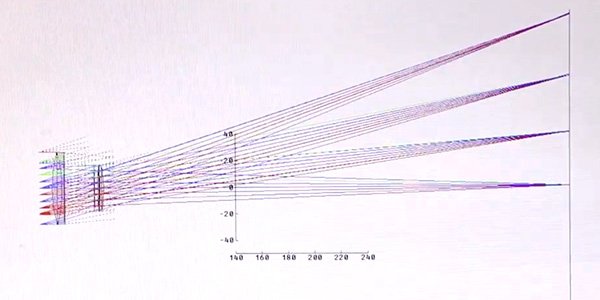
Ray-tracing resembles something like a shooting board, but it is called Spot Diagram. Because the rays that all come from the same point and could all arrive at the same point, as we have seen, actually follow a distribution in some region of the image plane. The more they are concentrated, the sharper the image produced by a lens following the recipe given to the simulation software. The more dispersed they are, the more the neighboring points blend together and the blurrier the image will be.
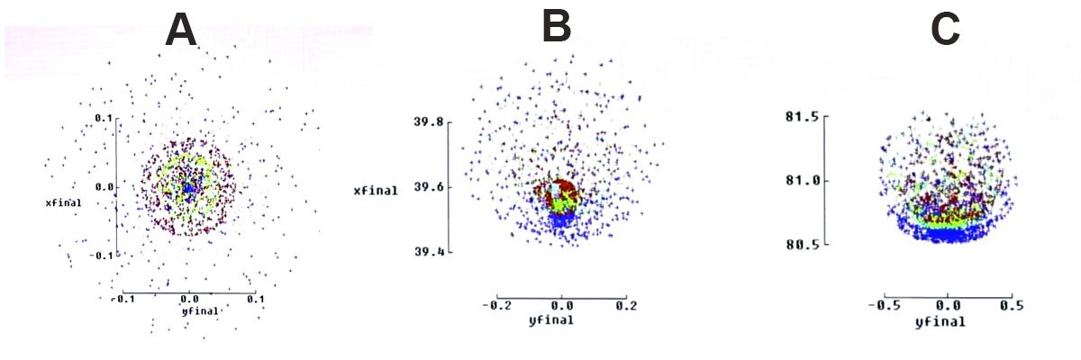
The above figures correspond to approximately 4,000 rays that have passed through the lens and would make these figures on the film or sensor in a real situation, but with the caveat that we wouldn’t see dots but spots because they would be like infinite rays and not just 4,000. The x and y scales give the actual size of these spots in mm, which are like photographs of the Circle of Confusion. The three situations shown correspond to:
A- A distant point on the axis of the lens. Almost all the rays are concentrated at less than 0.12 mm diameter (see the scales). But there is a dispersion that forms a cloud around this well defined circle.
B- This is already an off-axis point and would hit the film/sensor, roughly between 39.4 and 39.8 mm from the center of the image. Note that it is no longer symmetrical, there is a concentration in the part closest to the center and a denser cloud around it. This is already a CoC that doesn’t quite correspond to a homogeneous disk, it has its own shape.
C- Now we are even further away from the center of the image, around 81 mm from the center. The CoC has taken on a very strange shape that looks like a well-marked blue half-moon with a tricolor ellipse just above it and a green band between them.
It’s important to note that for reading convenience the three diagrams above are not to scale. On the y-axis we have A ± 0.1, B ± 0.2 and C ± 0.5. This means that the spots away from the lens axis are much larger. A correct ratio image would give the following size relationship:
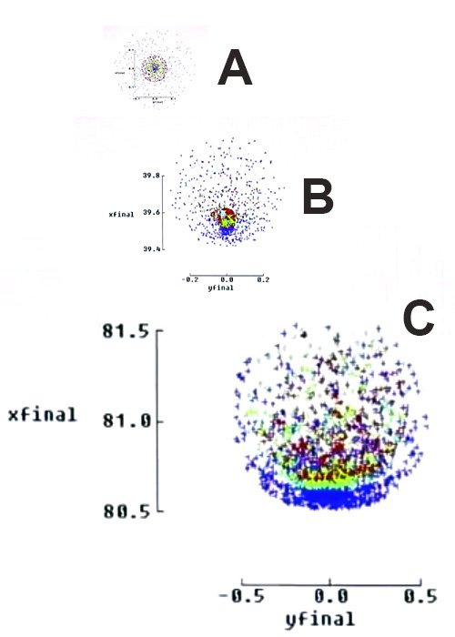
This means that in this lens the Circle of Confusion grows enormously from the center of the image to its periphery.
The photo below was taken with this Orthoscope on an 18 x 24 cm camera with the lens wide open. This means something like f/9 and its original focal length, according to the literature, should be 340mm. The restoration with the construction of the rear elements followed the historical specifications as much as possible and so these parameters have been preserved.

Looking at the CoC figures on the image periphery, it might seem that the image is unusable. Looking at the image above (click to enlarge), it’s clear that there is a very obvious loss of sharpness that goes beyond the blur caused by the Geometric Circle of Confusion, that is, beyond the blur caused by depth of field, but it’s not the end of the world and we can say that for this subject: a souvenir to the three who designed, cut the glass and polished the Orthoscope lenses, it worked very well.
Perhaps photography would be less interesting if perfect images were common place. Many photographers, through study and experience, know a certain character of certain optics and use them by playing with their idiosyncrasies. They combine the lens with the subject, with the choices of aperture, focus and shutter speed and thus manage to make images that are more powerful than those that could come point by point without any “flaw”.

This kind of consideration explains what gives lenses a certain “personality”. The specific way in which it generates an image that is not perfect can, in our subjective evaluation, result in associations with aesthetic and emotional attributes, such as a dreamy atmosphere, softness, impact or movement, as is the case with the swirl effect that many lenses produce in the background where there is no more focus, the region called bokeh.
The weight of manufacturing in the final result
The design of the lens already determines much of its performance, but not everything. The Geometric CoC is known, it is relatively the same for all lenses, and the Minimum CoC must be calculated or simulated for a specific design. These are fundamental quantities, but they will still have to pass from design to manufacture. All the parameters that are assessed in the design phase act as a kind of ceiling, a limit to what can be achieved in the best case scenario. Deviations in the manufacturing process are unlikely to improve a lens. That would be like winning the lottery.
The point is that there is no manufacturing process that is not subject to uncertainty. Every measurement has a tolerance range within which the final object can vary. Lens manufacturers define these ranges and it is the combination of the design and the precision employed in manufacturing that will seal the final quality of the lens.
It’s interesting to note that the weight of design vs. manufacture in final image quality is a balance that has changed throughout the history of photographic optics. At the time of the Elmar 50mm f/3.5 that equipped the first Leica in 1925, engineers were limited by the mathematics and calculation methods available (there were no computers). Manual calculations could reach a certain level, but at some point the refinement process had to stop and define what the lens would look like, even though it could still be improved. At that time, the design was more limited and the execution already reached very high levels of precision.
From the 1960s and 1970s onwards, the possibility of tracing thousands of rays in a short space of time and thus exploiting the virtues of a well-formulated concept to the full allowed wonderful lenses to be designed. This was the case with Nikon’s optics and also included redesigns of classics such as Leitz’s own Elmar. From then on, it was the manufacturing tolerances, such as the use of computer-aided machining, which had a positive effect, or the increasing use of plastic, which had a negative effect, that ended up outweighing the design.
Conclusion
The Circle of Confusion highlights how photography is a field of trade-offs where balancing gains and losses is the only way to go. Perhaps this is a general rule for life, but in photography, since we aim for so much of everything – sharpness, tonal range, resolution, contrast, sensitivity to light, freedom regarding sizes, etc. – this game in which every gain corresponds to the inevitable need to give something up, ends up making the rule even more felt and heavy.
Dealing with limitations can be frustrating at times but inspiring at others. You have to let go of the former and pursue the latter.