How to make things disappear in analog photography
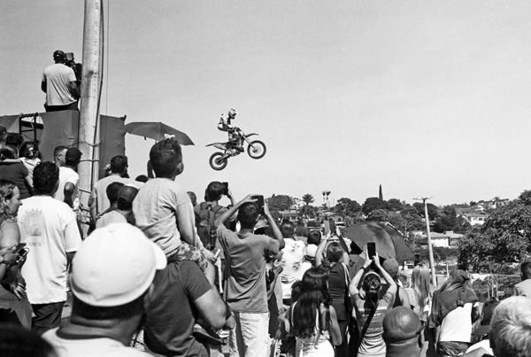
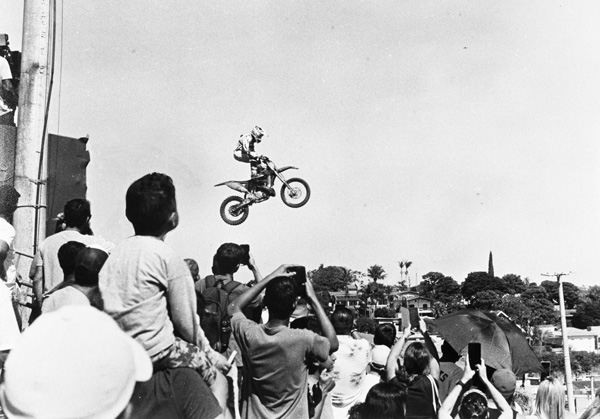
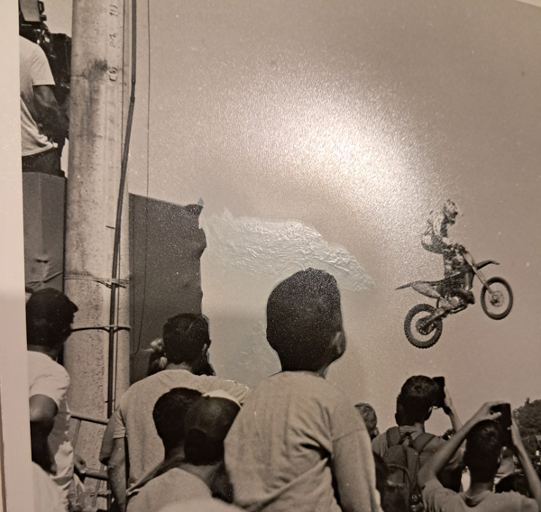
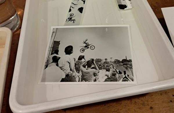
I took this photo at a motocross competition here in my city. I was using a Leica M3 and a Summicron 50mm f/2 lens, both from the 1950s. The film was Double-X. The image above is a scan of the entire negative. Although my goal is always to print using the analog method, I usually scan first to select the photos and plan what and how I will print them.
For me, the interesting point is the boy’s interaction with the motorcycle. Although we don’t see his face, his relaxed posture and attitude lead us to believe he was captivated by the bikers’ jumps. What really gets in the way is the umbrella, which, although much further away, hangs over his head. I thought it would be great if I could remove it and also crop out some of the landscape, as if using a longer lens. To simulate what this would look like, I did it in Photoshop and got the result below.
Much better, right? I could do a more detailed scan, retouch it digitally, and print it that way. But these photos I’ve been taking of people and events in the city are going into albums where I only put analog prints on fiber paper. So using an inkjet was out of the question.
Since I really liked the photo, I decided to do an analog retouching exercise, like they used to do in the old days, which consists of printing, retouching the copy, rephotographing, and printing again. Here’s the step-by-step.
1 – First print
Since the photos in my albums are usually 18×24 cm or smaller, I didn’t need to start with anything larger than that. I made a print in that size, 18×24 cm.
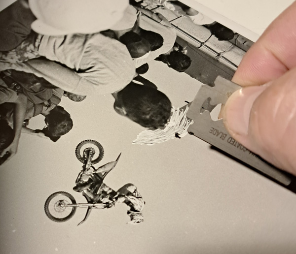
I used Ilford resin-coated RC paper because, since I was scraping off what I wanted to remove, I thought the resin-coated paper would scrape better than a fiber based paper. I scraped very gently, without forcing the blade, while the paper was still wet. The surface held up well and was smooth and flawless.
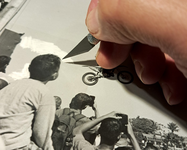
2 – Protecting mask
I applied a mask only to the area in contact with the scraping. It’s a mask sold at art supply stores. It’s very thin, and its adhesive doesn’t affect the surface it’s applied to. It can then be easily removed. Using a sharp blade, the mask is cut along the contours of the image. Ideally, be careful to only sink the blade deep enough to cut/mark the mask and not scratch the paper.
3 – Brush painting
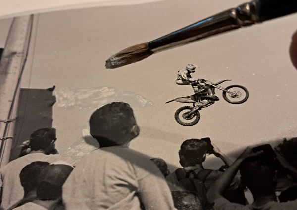
Next, you need to paint the scraped area in a way that matches the surroundings. In my case, it would just be the sky, a solid background. I used acrylic paint and mixed black and white. There’s no need to worry about warm or cool whites, as it will be rephotographed, so only the luminance matters.
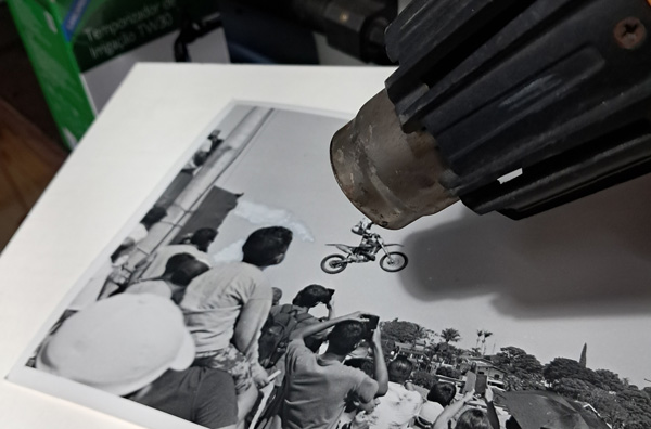
An important point to note is that the paint tends to darken as it dries. Therefore, it’s necessary to prepare a lighter shade. To speed up drying and evaluate the result, I used a heat gun on a not so hot setting.
The paint can end up looking quite rough, as shown in the photo above. Here, we can see the dry paint already in the gray value of the background, the still-wet paint clearly visible and lighter, and we can also see the mask that hasn’t yet been removed.
4 – Air brush finish
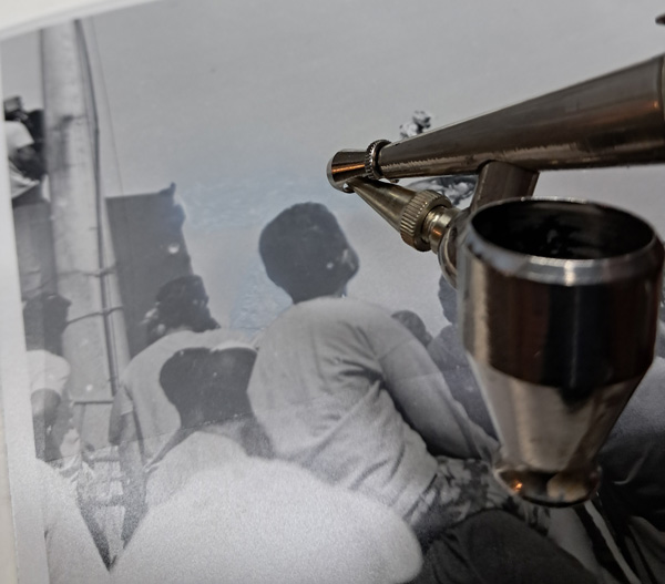
No matter how well the gray tone is applied, there’s always a harsh transition between the painted area and the original background. An airbrush is ideal for blurring this transition. Using the same paint, you can create a smooth gradient. This is where the masking became essential to protect what couldn’t be painted.
A very pertinent question would be: why scrape and paint with a brush if you ultimately used an airbrush? The reason is that because the sky is a very light gray, it would be difficult to cover the dark umbrella with just the airbrush. Scraping everything to white and the heavy paint load provided by the brush was a short cut in achieving good coverage in a very close shade. If you were to erase a very dark tone, in a night scene, for example, you could skip straight to the airbrush phase because dark paint covers better than light paint.
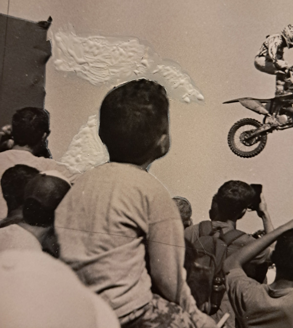
At this point, depending on the angle you look at it, the retouching is barely noticeable. This is what the photo above shows. What makes the retouching of its surroundings stand out most is the fact that the gray is slightly cooler than the gray of the paper. But this difference will disappear when it’s rephotographed, as black-and-white film won’t be able to capture such a subtle difference.
Besides the cooler tone difference, this retouched copy lacks presentation quality because the difference in gloss and texture is dramatic, as seen in the photo above, taken from an unfavorable angle. But while it’s an “ugly” copy, it’s ready for the next step.
5 – Second photograph
The original negative was made with a Leica M3, as mentioned above, meaning it’s a 35mm film in the 24 x 36 mm format. Ideally, when producing a new negative, it should be larger, as the paper image has much less detail and brightness than a real image. A large negative will render these details better, and its grain will tend not to interfere with the final print.
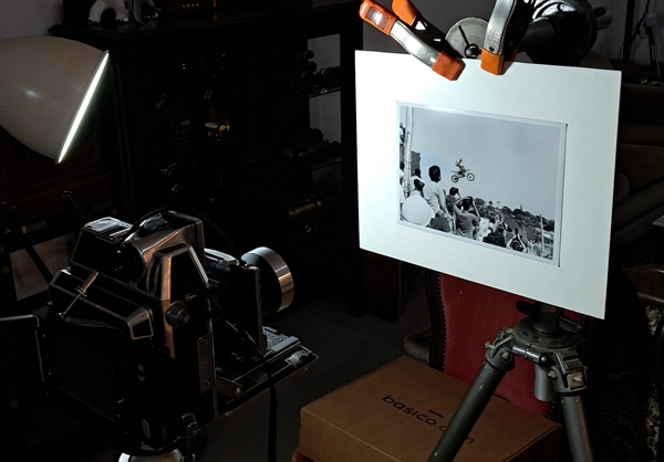
I used a Linhof Baby and a 6.5 x 9 cm negative. The film was Fomapan 100, metered at ISO 100. I used two 45° flashes, one on each side, each with 320W. The lens was a 1950s Tessar 105mm, already anti-reflective coated. I stopped down to f/11. This lens is famous for its excellent sharpness. The developer was Parodinal 1:100. Although it tends to produce grain, I hoped the large negative would offset this effect. On the other hand, since Parodinal has high acutance, it would help preserve the contours that paper tends to fade.
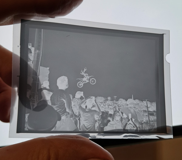
The result was very good and already promised that the retouching had been successful. In these cases, the difference between good and bad always comes from the comparison with the original. There’s always a loss of definition because each transition from one medium to another involves interference from the optics and the medium itself, due to the never-infinite resolution. The change always causes a loss of contrast and tonal range.
The larger negative is one way to counteract this effect. Using a higher-acuity developer and developing with more contrast are ways to try to slightly trick resolution and preserve tonal range, respectively. Regarding the latter, the 6.5 x 9 cm negative turned out very well. You can see in the image above that the difference between highlights and lowlights is more compressed, but it’s nothing that the multi-contrast of photographic paper can’t compensate for.
6- Final print
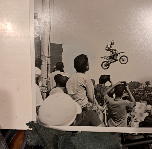
The final print was made at 15 x 20 cm (6 x 8 inches), and I took the opportunity to crop a bit more of the scene to give more prominence to the boy and the motorcycle. The negative was well-balanced, and it took no effort to adjust the exposure and contrast, which was achieved with a grade 2 filter.
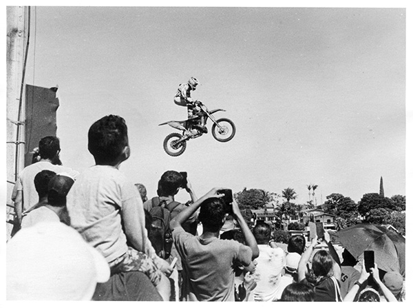
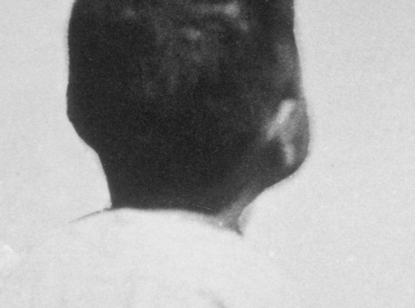
Above is a scan of the final print. Knowing the retouching and closely observing the contours of the boy’s head, one might notice something odd, as seen in the detail below. It’s from the same scan above, taken at 600 dpi. But for display purposes, for people unaware that the photo was retouched, or for my memory of this boy enchanted by the bikers’ show on a sunny Sunday, the final photo is much more effective and affecting than the original.
That said, if we compare the first photo in this post, which was a direct scan of the original negative, with the scan of the final print, it’s clear that the transformation takes its toll. Such is life.
Conclusion
It’s a laborious process that doesn’t compare to the ease of the digital world if the goal is simply to have a final print without that umbrella. But doing it today, all the way in the realm of analog photography, is a fun challenge and, in the end, very rewarding to see the final result.
There are many other types of retouching in analog photography. Retouching by lowering the final print, to lighten areas of the photograph or even eliminate them for a washed-out white, for example, has always been widely used for more aesthetic purposes. Another type of retouching, widely used in portraits, was done on the negative to eliminate wrinkles, skin blemishes, or attenuate volumes. Spot retouching was also used to add sparkle to eyes. However, these are minor compared to retouching with re-photography, as it allows you to include or eliminate anything through painting and even collage, bringing together the most diverse elements. The more or less convincing result depends solely on the retoucher’s skill. But if we remember that from the beginning many photographers were trained as painters and draftsmen, we must be very careful with “fakes” from the past. There was no naive era in photography, and simply because it is photography, without knowing its origin or process, Roland Barthes’s formula, “ça a été” (that is, in the sense that what one sees actually happened) has only theoretical value. A classic case of a fake, even without any retouching, is the Conttingley Fairies.
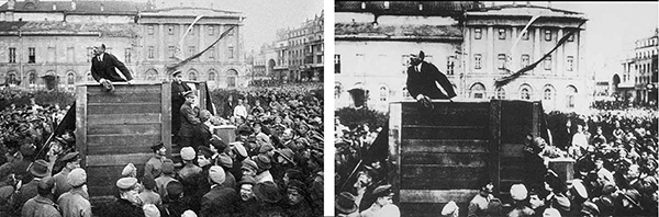
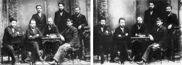
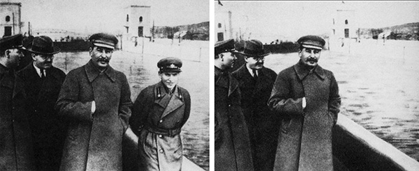
An anecdotal case of photo alteration, perhaps the most famous and often cited, is that observed during Joseph Stalin’s reign in the Soviet Union. It is known that he ordered the killing of dozens of people who were very close to him, as well as hundreds of thousands of those more distant. “Comrades” who fell under the leader’s suspicions were murdered. Not content with erasing them from real life, the regime’s official photos were also retouched, making people disappear. The examples below show cases ranging from simple erasure against a more or less neutral background to others in which the scene had to be recomposed to fill the void. Note the loss of detail and mid-gray tones in the new versions. Compare, for example, the platform where Lenin is in the first photo, the before and after, or the dark coats in the following photos. These images are from the website: Russia Beyond, if you have historical curiosity beyond photography, there you can find more details about who the erased people were.