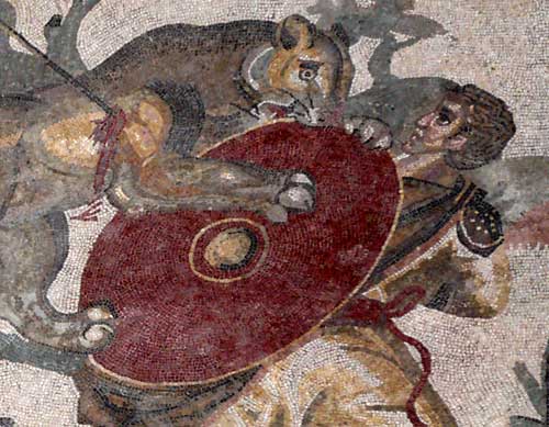
At the heart of digital world we find the “bit”. At the heart of digital images we find the “pixel”. The pixel was already know in Antiquity. But as for the want of fine electronics it used to be made out of little stones and “files” were called mosaics. The farthest we look to a mosaic the less we see the little stones and more and more the image will look continuous instead of pixelate or digitalised. That happens, roughly speaking, because our retina is also pixelate with light sensitive cells. Then, when two little stones from the mosaic start to fall over the same retina cell, we don’t tell them apart anymore and interpret it as a color surface. When we get closer to a mosaic then we understand how the image was built and we can admire the craftsmanship in picking the right color in its multiple and so subtle shades. Also the patterns by which they are arranged, following the drawing dynamics, are also the result of a lot of skills and intensive labor.
In digital image’s case the pattern is absolutely regular: it is a grid, a checkered board, with all pixels having the same size and shape, arranged like in a coordinates system as in fact they are. That is true for the digital image that is printed over paper or displayed on computer screens, tablets, mobile phones and on the back of digital cameras. The real size of a digital pixel in a computer screen is much smaller than a mosaic stone. For this reason, the effect of its blending, that for mosaics depends of being dozens of meters away from them, in digital images’ case, even the closer we can get focusing the screen with bare eyes we can’t make them one by one. But they are there.

We can’t see an image like the seagull above as a pixels’ mosaic. In order to do that we need to give more resolution power to our eyes. If you use a good loupe on your monitor you will realise that indeed the image is made over a very find grid. An option for that can be an normal lens from a mono-reflex camera. It is a very good loupe that many people have home without knowing it. For the photo below I could afford the luxury of using a Canon 50mm f1.2 and took a picture of what I could see with it. The grid is already clearly visible through the lens.
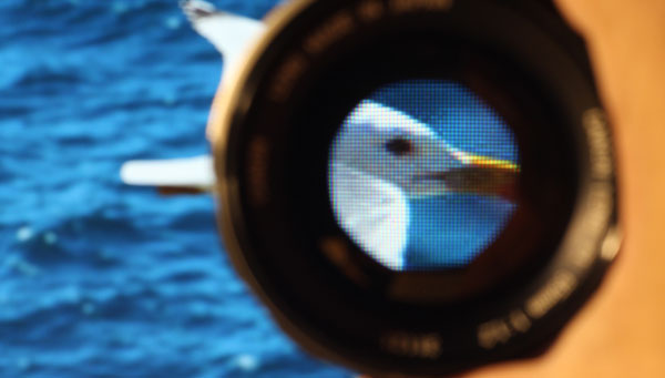
But if we want to see the pixel in its more intimate parts then we need to go further. I used a Olympus 80mm f4 macro lens with an extension bellows. Thanks for an adapter ring, I could attach it to a Canon Rebel T3i and that yielded the picture below.
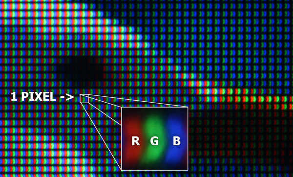
What we have here is part of seagull’s head. Now, finally, we have a pixel comparable to a mosaic stone. It is square and has three color patches inside it: Red, Green and Blue, the so famous RGB. The enlarged pixel that shows the RGB letters is just a cropping from the original image before I reduced it to fit into the post size. I mean, it is not a drawing. I used an old Apple Cinema Display monitor. Other makers and models would present a different geometry, but basically, LCD displays will show three patches like this. That boomerang shape is, maybe, characteristic of this specific screen. The important thing is that all of them must keep the essential, which is, the regular grid with dots and in each dot the possibility of showing the three colors RGB.
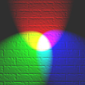
Let us consider now what would be “picking the stones” in this digital mosaic. The arrangement and shape of each pixel is given. What changes from one stone to the other is how much each color is lit. We can think that each pixel is a set of three minuscule lamps. One is red, other green and another blue. What is left for the software that will assemble the mosaic is, for each pixel, the possibility of turning off each lamp, completely, making a black pixel, or to lit them up in full power, making a white pixel, and yet all the intermediary possible combinations of that. Having the correct relative intensities the three primary colours add together make white. The effect of blending them by actual overlapping or having them side by side like in a pixesl grid it the same. That is what is happening when you look the background of this text and see it white.
Note that on the upper part of seagull’s head we had a bright sun light hitting it, the three colors are lit with the highest intensity in relation to other pixels. On the bird’s eye, the three are off. Where the feathers were in the shade (around the eye), the light reaching it came only from the blue sky and that resulted in a bluish white. Note that the three colors are lit in a lower level intensity compared to the part hit directly by sun light. The beak, which is dark yellow, Red and Green are lit but Blue is very dimmed. That yields yellow.
We can think of each pixel on the screen as a tripartite unit. Each third has a quality which is the color, and a quantity, which is the intensity of the light it emits. The pixel, in high definition equipments, is small enough to prevent us from seeing the three colors apart with bare eyes. Even the whole pixel is small enough so we can’t make it individually even getting very close to the screen. The colors that we see in different parts of an image are the result of that mixture by juxtaposition of three primary colors. Different shades depend upon the proportions in intensities of each one of them. If you want to look more in detail how what color is in terms of color perception, you should read this post: light and colors.
The key that each image file, being it jpg, tiff, png or whatever, supplies to the software that will render it on screen is, for each pixel, how much of R, G and B it has to load. That information is numeric, there is a value for each color in each pixel that determines its intensity. That value must go from a minimum that, without being creative, somebody set it to zero, and a maximum that for most of the digital color systems is 255. Therefore, there are, for each of the three colors, 256 (zero counts) levels of intensity to be rendered by the hardware outputting that file. Whether it does or not it is something that concerns the screen producers. When a monitor receives the information that the 18th pixel of the 25th column must have Blue set to zero, it “turns off that lamp” on that pixel. Case the information is to give it 255, it will lit it up to the maximum the hardware is set to deliver. When one changes the brightness of a screen, what he does is to raise up or bring down that ceiling. But in any case the value connected to the maximum is 255.
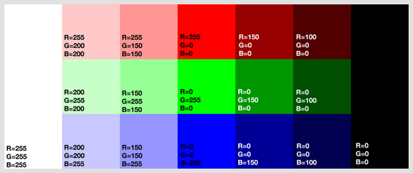
On the above diagram we have in the central column pixels having only one of the RGB colors totally light up with 255 value. The others are set to zero. Those are the pure colors with the highest intensity your monitor can output. Going to the right, without adding other colors, we go reducing the brightness of these basic colors. First to 150 and then to 100. The RGB colors start to dimm and when zero level is reached we get the max black that you monitor can show. Going to the left, keeping the basic colors at 255, we start raising up the others on the same proportion. First 150 and then 200. The effect is a loss in strength, colors fade to white. On the 255,255,255 situation we have the brightest white that you monitor can show.
Note that with 256 possibilities for each of the three colors we have 256 x 256 x 256 = 16.777.216 of different colors that each pixel from an image file can ask to a certain equipment to deliver. That is not infinity but is far more than our eyes can distinguish as individual colors. That means that there are colors with numeric values which are different but our brain interpreted, based on what it learns from our eyes, as being the same.
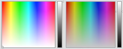
On the above diagram, made out of two screen-shots from Photoshop Elements, we have possible combination of RGB values. For the one on the left we let the values go from zero to 255. That is why at the bottom we have pure white maximum, that means, when the three colors are set to 255. For the one on the right, we have a limit to the maximum value set to 200. That is why it becomes darker overall and at the bottom we have it gray compared to the first diagram. That limit on RGB values is indicated on the grey bar on the right of each color palette.
As a conclusion: the pixel is something having like two states:
- Information Pixel: First one is pure information stored in an image file. Let us say that there we have rather a pixel recipe that is only potentially a pixel. On that state it is defined by three numbers, each one between zero and 255, correponding to the RGB colours. In some cases there is also information about transparency, a situation in which hardware will assume, while printing it, the values that “were” there before the new transparent pixel “arrive”. Other systems use even more levels than 256 for each RGB although with 256 we are already in the so called “true colour” and each pixel consumes theoretically 3 x 8 = 24 bits. I say theoretically because if there are opportunities to shorten that, normally, software will go for it. When a specific colour is repeated many times, the same way we do with words in texts replacing them by abbreviations, it is possible to use something similar with image files. The difference is that with 16 millions of colours, chances are that they will not repeat that often, in those cases software will pick the ones that look alike and make them equal. That is why when you compress too much a photograph file with subtle gradations, quite often you get flat colour surfaces and patterns instead of a smooth gradient.
- Physical Pixel: The second state is the concrete pixel, material, a state it assumes when a software reads those figures and a hardware transforms them in a physical thing, able to emit or reflect light. The computer reads each pixel in the file and send the figures to the screen. Screen transforms them in a light emitting dot. The printer receives the figures, read them for each pixel and transforms them in a reflective dot on paper with the right color proportions. Those are not the RGB anymore but rather CMYK (cyan, magenta, yellow, black) which are the basic colors suitable to reflective surfaces. Large light panels and billboards having several square meters in area may have pixels as big as mosaic stones or even more that that. As we see them from afar, even being big, we will mix them up anyway. The supports intended to be at the reach of an arm, like computer screens, tablets, photos and the like, need very small pixels so we can’t see them one by one. In any case, bigger or smaller, pixels are not made to be seen, we look only to a crowd of pixels that all together we interpret as an image.
Each pixel is NOT identical. Each pixel is unique in shape like a fingerprint or DNA. To the human eye a pixel seems to all be uniform but under a high powered microscope or analysis by chromatic dispersion you can see deformities in each. No two pixels are alike from birth. All data comes from images. All images consist of pixels. It is the data derived from pixels that provides meta-data. Meta-data is data about the data.
Those that work in the binary world of data (research the history of George Boole) will discover the data driven world does not grasp that all data is derived from an image. Everything is an image first. With “Big Data” and data analytics they are leaving a lot of data on the table by just topographically extracting data from the image source.