With digital cameras is always good the possibility of checking the result right after the click. Those who never used film don’t know how good it is. But sometimes, a quick evaluation may show that the picture registered is OK and later, on the computer, we realise that shooting it was not at its best. If that happened to you, than this post may help you to avoid it in the future. Histograms are an effective evaluation tool for exposures mismatch between what scene provides and what camera is able to capture. But o use it, it is important to understand what it is, how it is done and what it says.
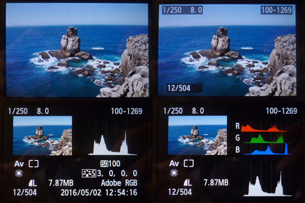
The pictures above show the different modes of visualisation for Canon Rebel T3i (or 660D). All cameras presente some options going from only the scene up to a more complete report. Checking only the scene is enough only to detect obvious mistakes. I am considering a mistake when the file you generate will not allow, or will demand a lot of work, in order to get a final print the way you imagined it at the time of shooting. Histograms are good to prevent some of the future problems you may have as far as you stay within camera capabilities. Knowing how to read these graphs and having the real scene in front of you, it will be easy to judge if what you registered will in fact yield the result you idealised. I believe that doing “manually” a histogram is a nice way to understand how it works and develop the capability of interpreting it.
This picture was made in Peniche, Portugal. The window with a RGB histogram (the three colours combined) was superimposed on it from its own histogram from Photoshop Elements. It is different from what is shown the camera screen (above) but we will let this point open for a while. Let us go through a step by step procedure to “make” a histogram.
Making a luminosity histogram
[mks_dropcap style=”square” size=”20″ bg_color=”#ff0000″ txt_color=”#ffffff”]1[/mks_dropcap]
This picture serves well our purpose because it goes from washed whites on the foam till very deep blacks on the rocks slits. It was done at 1/250 s, weighted centred exposure metered, aperture f8 and ASA 100. Original size 5184 x 3456 px. It was reduced to fit on this post and the one on the left has 300 x 200 px, if your browser is zooming at 100%.
[mks_dropcap style=”square” size=”20″ bg_color=”#ff0000″ txt_color=”#ffffff”]2[/mks_dropcap]
The histogram is made from numeric RGB values for each pixel in the image and, the fact is, that in order to manually make our histogram, even 300 x 200 = 60,000 pixels, is far too much. So let us get it squared by giant pixels measuring 20 x 20, original ones from this already reduced image. If you find this strange maybe you should read first Pixel’s Anatomy, and then come back here. The RGB value for giant pixels will be the average among pixels falling inside a square. With that trick we end up with 15 x 10 = 150 pixels, which is more of a human dimension. Yes, there will be a tremendous loss in definition, but as our objective here is about producing an histogram, it is better a simpler image albeit graceless.
[mks_dropcap style=”square” size=”20″ bg_color=”#ff0000″ txt_color=”#ffffff”]3[/mks_dropcap]

On the left, each square has 20 x 20 = 400 pixels, all the same among them, with RGB values that were averaged from previous image. Let us consider each one as a pixel. I made it using filter>pixalate>mosaic in Photoshop Elements (let us call it PE). We can see that it became a very rough version that preserved only sky and sea masses of blue and some rock tones in the centre and lower right. In the next step even those reminiscences will be discharged.
[mks_dropcap style=”square” size=”20″ bg_color=”#ff0000″ txt_color=”#ffffff”]4[/mks_dropcap]

So one more simplification: let us turn it all to gray shades. In cameras you can see histograms for each RGB individually or a luminosity histogram (see screen shots at the top). We will concentrate by now only in luminosity and that is why it was converted to gray. I made this in PE using image>mode>grayscale. PE makes all RGB values the same for each pixel (that makes them gray) using an algorithm that attempts to adapt to our luminosity perception according to each colour. Those algorithms vary from one software to another and they do not use the arithmetic mean of RGB values.
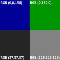
A green RGB(0,150,0) looks brighter than a blue RGB(0,0,150), for instance. That is because our eyes are more sensitive to that colour. Then, to convert to gray, a 150 green worths more than a 150 blue an pulls a lighter gray. Test it yourself: paint a square in green RGB(0,150,0) and convert it to gray. Then paint a square in blue RGB(0,0,150) and convert it to gray. You will see that the former one will yield a RGB(129,129,129), while the latter will give RGB(37,37,37). Looking to the figure on the left it seems to me that it corresponds well to our perception of luminosity for each one of them.
[mks_dropcap style=”square” size=”20″ bg_color=”#ff0000″ txt_color=”#ffffff”]5[/mks_dropcap]
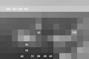
What now if we read the gray values for each square? You can do that using the PE eye drop or something equivalent. I used an application called Digital Color Meter that comes with MAC OS. If we pass the pointer over the image we can read the RGB values for each square. The way it was made the values are the same inside each square and among the three RGB colours. The lowest (darker) one that I found was RGB(43,43,43), and the highest (lighter) RGB(208,208,208).
[mks_dropcap style=”square” size=”20″ bg_color=”#ff0000″ txt_color=”#ffffff”]6[/mks_dropcap]
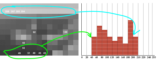
Now let us say that we want to classify and count all of the 150 pixels, by type (shade of gray), and pile up the ones with similar value. For that, we draw a horizontal like marked with a scale going from zero to 255 (possible values for RGB), in intervals of 20, and let us say we lay a brick in each interval every time we find a pixel inside that value range. That will yield a figure like the one above.
That means we just finished a manually made histogram for a simplified Peniche picture. That is the key concept, the histogram classifies, counts and represents pixels from an image. The original photograph, the one coming directly from the camera, had 5184 x 3456 = 17,915,904 pixels. Its histogram follows the same principle of piling up pixels with same values over a scale from zero to 255. At the end what you have is called a distribution of RGB x quantity by which pixels show up in the image.
Diferences and uses of luminosity, combined RGB and RGB individual histograms
It is instructive to see those differences among types of histogram when the image in question is practically a monochrome. I say “practically” because never a photographic camera, even pointed to a flat colour wall, will exhibit all pixels with the same RGB values. There will always be a fluctuation around an average as there are variations which are inherent to the capture and record system of an image and, probably, the scene in itself presents variations in light, texture and other factors that make what we call perceptually “one colour” is indeed a “chromatic region”.
Picture on the left was made with a electronic flash Olympus T32 (a vintage flash) bounced on the ceiling, with a Canon Rebel T3i (660D) and lens 50 mm f1.8 set on f8. It serves only to explain the origin of the following pictures with its respective histograms. The experiment consisted in pointing the camera to this wall, having a sort of brick colour, and making a series of photos changing only the lens aperture from 8 to 2.8, one point at a time.
The following sequence showing the pictures with their respective histograms, was made directly from Canon’s screen using a Lumix DMC-FH3. We have then, for this monochromatic wall, the individual RGB histograms, and below them, the luminosity histogram.
The combination of bounced flash and f8 (first in the sequence below) yielded an image that fairly corresponds to a perception one would have being himself in this room. The first picture, showing the room, is intended to explain the environment. This remark is important because in images in which a flat surface is presented, without any reference about what it is, what time of the day or what kind of light was there, in both cases of digital media or film, it is impossible for someone not having the “in loco” experience to tell whether a gray is a black surface well lit, or a white surface poorly lit. That means that film or digital sensor, record only quantity of light and if we don’t know what is in the picture, we will never be able to tell what was the share of object’s color and reflectance and what was the share of lighting conditions on the resulting image. Most of the errors and problems related to incorrect exposure in photographs come from the fact that the photographer do not understand that (or do not make use of his understanding).
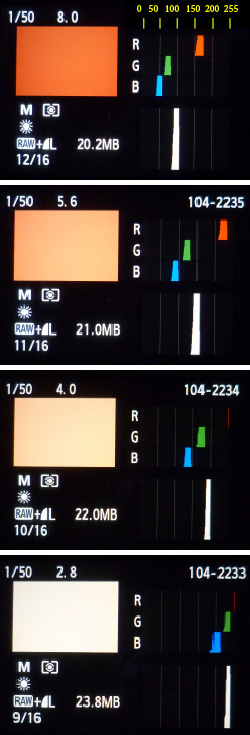
Each color, reproduced in RGB, follows a recipe that is a triad of values for Red, Green and Blue. Quantities in this recipe go from zero to 255 and, to ease or analysis, I added a scale in yellow at the top of the first histogram. Zero, means that the channel is turned off, and 255 means that the channel is presenting the maximum luminosity the hardware allows it to. If that is strange for you maybe you should read first Pixel’s Anatomy. We see then that when that brick colour is exposed to give a realistic impression it has on the blue channel something around 45/55, green is 65/75 and red is 160/170 (it is important that you actually find those values). Remark: it is not possible to check and measure your screen with a color picker as this histogram informs data from the file with the wall image seen on the screen of the first camera (Canon). Then it was captured by a second (Lumix). It was later interpreted by InDesign to make this composite of histograms, uploaded and converted by my blog hosting company and later downloaded by your computer. Each and every time a system interprets a pixel it renders it according to its own “understanding” of how that color should be presented to be a faithful representation of what it received.
The individual channel RGB histogram is the histogram, like the one we made from the Peniche picture, considering only values of one channel at a time. As practically all pixels from the wall picture shot at f8 have blue between 45 and 55, the “pile” goes up to the ceiling, while in other values there are no pixels marked. (note that the f8 in indicated as 8.0 on the top of the picture from camera’s screen together with the speed 1/50)
The luminosity histogram, is the one below the three RGB ones. On the picture with f8 it shows all pixels piled around 100. This histogram takes in to consideration the three channels and interprets them in terms of our luminosity perception. As wee saw on step 4, while building up the Peniche histogram, a value on green channel worths more than the same value on the blue one. Each software has its own algorithm to make such conversion. That is to say that the 100 that concentrates the pixels in the luminosity histogram is not exactly the arithmetic mean of three channels value.
It is interesting to analise what happens when we go down the pictures letting all parameters unchanged except the f stop that goes opening and allowing more light to get in. It is evident that the picture will become lighter. But let us observe how that is represented in the histogram. On the picture at f5.6 all the RGB an luminosity heaps shifted to the right. That happened because the lens opened up, more light passed through, more light fell on the digital sensor, each pixel on the sensor filled up more and when all those containers were read and converted into numeric values in order to write an image file, pixels received higher figures compared to f8. The luminosity histogram shifted from 100 to something around 150.
Now the over exposure effect can be understood graphically when we follow up till the f2.8. The heaps keep moving rightwards, colour goes washing out and, that is very important, at f4, red looks like about to fall outside the histogram, it is about to be clipped. That does not mean that we won’t have red no more. The opposite, all pixels in the image will have red channel lit to its maximum intensity. They will be all 255. Is that bad? It depends. When that happens the proportion of the three colours changes and do not correspond any more to our perception of the wall. When the blue and green start to get also closer to 255 it all becomes white. Even if you darken the image you will not recover that brick colour we learnt the wall has at f8. If there would be a texture dependent on variations of red, it would be destroyed. In a normal picture, different from this laboratory condition, the right approach to answer whether it is good of bad colour clipping would be what is our need of details in that region where over exposure is occurring. Maybe, the interesting part of the picture is in the dark zone of the histogram and that part may have been benefited by the sacrifice of highlights.
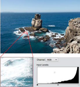
In Peniche’s picture, looking to waves foam with a partial histogram, the fact that pixels are accumulating against the right end of the graph, means that the brighter parts are falling outside the range where the digital sensor is yet able to differentiate intensities – at this exposure 1/250, f8, and ASA 100. We have there whole areas with RGB(255,255,255) and completely rid volume and texture. But the surroundings of those areas may complete and inform what is going on. It seems to be the role of those light blue that help in “drawing” the clipped area and give sense to those washed out whites. With more exposure, even the light blues would fade into white and maybe we would have more difficulty to interpret that part of the picture. With less exposure, maybe, we could have a better reading of foam but, that would certainly make darker the see and shades in the rocks would start to loose volume on the opposite part of histogram. Beyond a threshold, the fact that the picture was taken at 12:54 h, would conflict to our understanding of light at that time of the day. So in this case it seems like the given exposure was a good compromise and our brain can make up for what is left out by hard data from the picture.
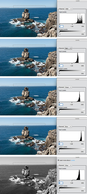
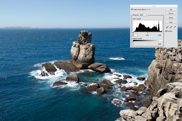
The combined RGB histogram is presented by image editing software, like Photoshop Elements 11, the one I use, and is exhibited by default when you enter in enhance>levels. Maybe that is not the better way to see a histogram. Going back to Peniche’s photo, above is again the one with the histogram the inserted from PE and it presents the three channels but not converted to luminosity, it is just the three individual RGB plotted together.
Let us examine a specific area and understand better what that implies. The histogram on the left was made based only on the dotted rectangle in the sky close to the horizon. So we have here a situation closer again to a monochrome. That light blue has a recipe or formula for RGB values that might repeat more or less the same over the entire marked area.
That is what becomes clear when we see the three heaps on the right third of the histogram. It is an analogous situation as the one we saw for the wall. Note that looking to the histogram we may think we have three different “things” there and that is not really true. What we have is the repetition of the same thing all over. That becomes more evident when we look to the subsequent histograms for individual RGB and the 3 heaps appear distinctively.
By converting the image to gray scale we see a far more understandable representation of one single heap for a very homogeneous area. That is the corresponding editing version of luminosity histogram presented by the camera, as PE converts to grayscale following the perceptual luminosity.
Before any conclusion that luminosity histograms are better representations of images than RGB combined histograms, go back and have a look again to the luminosity histogram for wall’s picture at f4. You will see that it showed a value still under control approaching 200, but in reality, we know that the red was about to be clipped at f4. That might be a good hint for exposure corrections that were not signalled by luminosity alone.
The conclusion is that the RGB combined histogram is good to ring the alarm at first sight in case one of the three channels is about to fall out of range. But it is not good at all if you try to correspond parts of the histogram to parts of image because, as we just noticed, the same shade might be split into three distant heaps. That is much easier (when it is possible, we will see that right after) to do that with luminosity.
As the needs and actions are quite different at the moment of picture taking and edition, I believe that luminosity and individual RGB are indeed the good options to have in the camera. Afterwards, for those who will go sliding pointers to right and left to control levels of blacks and whites and checking the results in real time, the RGB combined is useful because it shows all the time if you are throwing away information that was in the file. In that sense the RGB combined is a good one to have while editing an image file.
Same histogram and different images
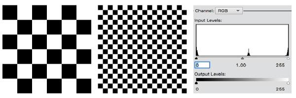
From what we just saw, it is important to highlight that identical histograms, or with the same overall aspect, may come from very different pictures. The above images are not photographic ones, they were made with InDesign. The point is to observe that both generate the same histogram (luminosity as the are black and white). Note that there are an accumulation of pixels in zero and 255. That is logic, but imagine that the squares would be reduced till we would see a gray area. The histogram would still be the same with blacks and whites. That means that in more uniform areas like sky, painted surfaces, skin (in general) and other situations where not much texture and noise are present, it is easy to imagine where those areas are in the histogram. While in surfaces with a lot of texture, abrupt changes and noise, those will spread pixels all over the histogram and the perceptual distribution of luminosity may be very different from what its histogram presents. That is the case of the rocks in Peniche’s picture in which we see very abrupt variations between shade and sunlit parts. An exercise interesting that tells a lot about an image is selecting small areas and inspect partial histograms. It is very easy if you select it with any selecting tool and hit command+L or CTRL-L to activate Levels.
This observation is just to dismiss a fairly spread talk that a good picture should have a well distributed histogram going from dark shades to bright highlights. A muddy image can well present a histogram like that and a beautiful one be completely unbalanced.
[mks_accordion]
[mks_accordion_item title=”What is that heap in the middle?”]
![]()
Maybe you are a bit intrigued by that the heap in the middle of the histogram that should have only black and white. Are you? If yes, very well observed. Here goes the explanation: When the vector image from InDesign was converted to .jpg, some transitions from black to white were smoothed using intermediate pixels in gray. That happens because as there are no half or fractions of pixels and while dividing integers numbers fractions may appear, the way software deal with that is by adding shades of colour to entire pixels. The enlarged image on the left shows the trick. It is very much used to render curves, serifs and other details in text that are often short of pixels and rich in design.
[/mks_accordion_item]
[/mks_accordion]
Light variations in the scene, rendered in images and seen through histograms
[mks_col]
[mks_one_half]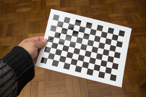 [/mks_one_half]
[mks_one_half]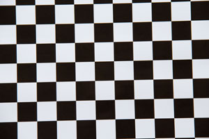 [/mks_one_half]
[/mks_col]
I will use the checkered figure to introduce an exercise with a photographic image. We will find an interesting aspect of image making. The checkered figure was done with InDesign, as said before. That means that, adjusted the dimensions, the software was instructed to use only pixels with RGB(0,0,0) or RGB(255,255,255). The result was printed in A4 and it showed up very convincing when inspected in my hands. Exactly what I would call a black and white checkered pattern. Next step was the making of a picture and that is the one showed above.
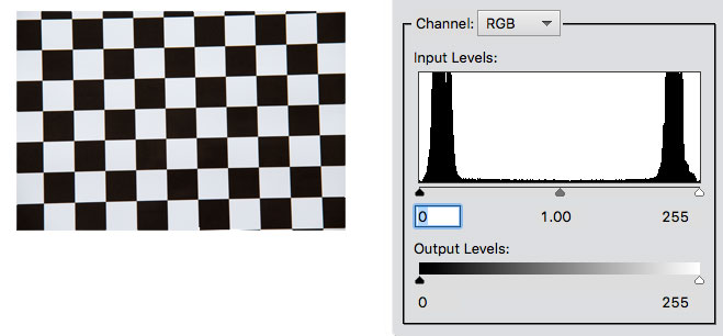
Now we have the picture with its histogram and the question is: Where did the RGB(0,0,0) and RGB(255,255,255), made by InDesign, go? Well, the fact is that we understand and see a checkered figure in black and white. The camera only sees but does not understand it. It does not give names. It only assigns values. What happened is that the blackest surface that we can make still reflects light when lit and the whitest surface we can make still absorbs a bit of the light falling on it. Under that condition, the factor between the portion less emitting (black squares) and the more emitting (white squares) light in that piece of paper was at the order fo 1/100. That is a characteristic of printed paper. Camera registered that difference and in its interpretation it gave RGB(20,20,20) and RGB(230,230,230), to blacks and whites, respectively. It reached that result and the histogram present it to us because a difference of 1/100 still fits well in its range of lowest and highest sensitiveness. If that would be 1/1000 it would be harder and 1/10,000 (as very often occurs in life in a scene that includes incandescent light bulbs and dark shades) that it would be impossible to fit both heaps in a histogram. It that would be 1/10,000, then we certainly would have only RGB(0,0,0) and RGB(255,255,255), in case we would have adjusted exposure to an intermediate value as that mean would not suit neither the high or low key. Both heaps would fall out of the histogram. That means, only if differences were higher than what the digital sensor can embrace, we would have both heaps inside the histogram as it happened with the piece of printed paper.
Taking a photograph, film or digital, is about making fit, total or partially, the range of luminance in a scene into a range of sensibility to luminance that the sensitive material can record. There is a threshold for a minimum stimulus to produce any recording and a maximum stimulus beyond which it all will be recorded the same.
What you should know by now about histograms
Well, we went through the main points by examples and exercises but now it is time to sum up the key theoretical points you should bear in mind in order to be able to take your own conclusions about situations you will face while dealing with digital images and inspecting them with histograms. I hope the key points listed below will look very reasonable and understandable:
[mks_dropcap style=”square” size=”20″ bg_color=”#ff0000″ txt_color=”#ffffff”]1[/mks_dropcap] The histogram indicates in an horizontal scale from zero to 255 the relative quantity of pixels present in an image giving a higher height, over each value on that scale, to those that appear in the image with a higher frequency. That can be shown for each RGB channel individually, all combined in one graph or converted to luminosity values.
[mks_dropcap style=”square” size=”20″ bg_color=”#ff0000″ txt_color=”#ffffff”]2[/mks_dropcap] If luminance latitude by RGB color in the photographed scene goes beyond the camera’s sensitivity latitude, to the areas where this occurs, the sensor will saturate in 255 or will stay at zero level according to its incapacity to deal with so much or so little light, respectively. To be inside or outside the range of sensibility depends, on top of the scene in itself, its physical conditions, also from the exposure given to it, that means, the combination of shutter speed, aperture and film or sensor ASA.
[mks_dropcap style=”square” size=”20″ bg_color=”#ff0000″ txt_color=”#ffffff”]3[/mks_dropcap] By giving more exposure, camera receives more light and histogram as a whole shifts to the right. By reducing exposurem, camera receives less light and histogram as a whole shifts to the left. In this way, within certain limits, we can make in a way that the scene’s range of luminance get in and out the camera’s sensitivity latitude to one side or another.
[mks_dropcap style=”square” size=”20″ bg_color=”#ff0000″ txt_color=”#ffffff”]4[/mks_dropcap] A histogram that shows a well distributed population of pixels, going from close to zero to close to 255 for the RGB colours, not compressing parts of image against the limits zero and 255, means that the exposure set for the camera was enough to capture both ends of high an low light in the considered scene. In general, that indicates an image with a wide contrast.
[mks_dropcap style=”square” size=”20″ bg_color=”#ff0000″ txt_color=”#ffffff”]5[/mks_dropcap] A histogram that uses a small part of the scale from zero to 255 means that the camera was able to comfortably register all the luminance range present in the scene. Certainly, that indicates an image with low contrast, less variations among RGB values that can be in the middle, light or dark areas.
[mks_dropcap style=”square” size=”20″ bg_color=”#ff0000″ txt_color=”#ffffff”]6[/mks_dropcap] It is possible with post production to make the histogram to move left and right, to expand or contract. That means to make the image lighter or darker, more or less contrasty. It is possible to get closer or farther pixels which are different one to another. But those which are in the same value, will not wide the gap as there is no gap and there is no way to show differences when the camera made them all flat. That is the case of pixels at zero or 255, black or washed white areas, but it is also true for medium shades.
[mks_dropcap style=”square” size=”20″ bg_color=”#ff0000″ txt_color=”#ffffff”]7[/mks_dropcap] As a general rule, when you contract the image latitude, the only loss is the latitude in itself, as you are just throwing away information. When you expand the latitude, software is requested to “create”. It will do it averaging, interpolating and the like. The effect can be very artificial and passages will be introduced at the expenses of more noise. For that reason, the ideal situation is to explore well what the image offers and register the best you camera can and leave the minimum of adjustments for post-production.
Last remark: what it means to shift, expand and contract is something that the understanding of a histogram should make clear. How to perform such adjustments will be a subject for another post.
This is a great article, thanks for a rigorous but clear explanation! I recently wrote an article about histograms of famous photographs which is less technical, more focused on aesthetics. Maybe you’ll find it interesting too! I wish I knew about your article when I wrote mine; I would have linked it. I will see if I can add it retrospectively.